“But why?”
A simple question, but what very well could be a guiding principle for any website.
I routinely see website owners who spend hours on a blog post, but don’t bother to consider how they’ll drive traffic to that post…
But why? Why are you writing this?
I also see many others, and myself included, spend hours on their site’s content, only to disregard calls to action and encouraging next steps…
But why? Why are you putting this content out there, and what action do you want your visitors to take after taking it all in?
Far too often do we fall into “if we build it, they will come,” and almost just as worse, “When they come, they will buy/sign-up/share/comment.”
Even the greatest content won’t get seen if there isn’t a plan for it. And, the greatest content even when seen can fail to move the needle if there isn’t a plan for it.
How to Encourage Website Visitors to Take Action
To get website visitors to take action, you need provide them with the means to do so. A link can’t be clicked if it’s not present, and a form can’t be filled if it doesn’t exist.
Thus, the very first and easy step to getting more website visitors to take action is to provide them the ability to actually do something.
I will say, tools and plugins are a huge help in this regard. Some are free, others are paid. I utilize a little of both, and will be mentioning them throughout the post. Here is a brief summary:
5 Ways to Encourage User Action
1. Include links to click
Let’s start simple; no fancy tools or plugins needed.
Links—the foundation of the internet, right?
Think about the blogs you read and the websites you visit. Rarely if ever are you going to encounter content that doesn’t have a door to more content, either on that same site, or on another.
[adsanity id=”3475″ align=”alignnone” /]So, take that approach with your website, and just start by adding links where it makes sense. This can include copy mentions of a product or service you offer, or a blog post that provides additional detail on a concept you just mentioned.
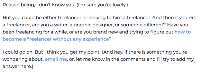
An example from this blog:

Plus, internal linking is a key tenant of SEO. For instance, yes, it made sense to include the link above to that specific freelance writing blog post, but I was also trying to rank for that term of how to become a freelancer without any experience, and the link helps that along.
Again, including links should come naturally—if you’re reading your content or looking at your site and think your website visitors would appreciate learning more about something on another page, then it makes sense to add a link.
Here are some basic ideas:
- Basic menu navigation
- Body copy (as mentioned above)
- Links to “about us” or LinkedIn profiles
While the above might seem random, it is. Only you know what the goal of your website is, and what you want people to do when they visit.
Remember, “but why?” Why are people reading your blog post and what do you think they’ll want to do next. And yes, this will differ from post to post!
2. Add mid-post callouts
One of the issues many have with implementing tools and tactics that could encourage website visitors to take action is that they don’t want to be annoying or intrusive. (It’s actually a really great approach.)
But, like anything, balance helps, and while I totally agree that a thousand ads and CTAs on a page takes away from the user experience, having a few that are well thought out and executed nicely can enhance the user experience.
Thus, if you’re just getting started with this, a mid-post call out might be an easy, less intrusive way to about it.
One example is a seamless inclusion that highlights a particular part of text in order to focus the reader and get them to take action, like this:

The above content is still part of the post’s main content, but the highlight draws attention, and then as you can see, a link is added as well for them to take action. (This is done with WP Shortcode plugin by MyThemeShop.)
Additionally, you can take things up a notch an provide a call out with a call to action, which could be a good way to build leads. This method results in a call out that is less in tune with your blog’s content and purpose, and more about providing an “upgrade” or an opportunity for readers to unlock even more.
I suggest checking out the example galleries from OptinMonster for inspiration, but as an example, it can be as simple as a sort and sweet email form:

3. Utilize secondary callouts
Now again, putting something front and center, and in the line of sight of an engaged reader could be a reason why the above callouts work in terms of getting website visitors to take action.
But on the other hand, you may feel you’re getting in the way of their experience, and I totally understand that.
So, a similar, less intrusive way to go about it is to look to secondary areas like the top or bottom of the screen rather than the middle, or even the right-hand sidebar.
For the top and bottom, you’re basically taking the above in-line example and making it “sticky” so that it’s constantly floating at the top or bottom of the page.
This is the form you see appear at the top of my pages:

The same idea can be applied to your sidebar (again, as you see on the right-hand side of this page). You can also get a little more creative and have a form or CTA “slide-in” after a certain period of time.
Which brings up a great point—these forms, buttons, and callouts can all be triggered through user action, which might also increase engagement. For example, if you wanted, a form can only show when:
- Distance scrolled is 50%
- Time on the page is 30 seconds
- Page URL only contains “freelance”
You get the point! Through a tool like OptinMonster, you can control when and where these CTAs are displaying. In fact, here is the full list of display rules:

You see options like:
- Time on Page
- Page Targeting
- Physical Location
- Referral Targeting
- Returning Visitor
Exit intent pop-ups can also fall into this category, but I think you get the point—either put something in front of your visitor while they’re reading, or trigger a CTA upon action like a scroll or attempt to exit.
4. Make yourself available
Last, “action” is broad. As you can see from the above, taking action can mean clicking a link, filling out a form, downloading via a button, and more. The action that’s best depends on your site and your goals.
Read More: Template for SMART Goals
So, it doesn’t always have to be about acquiring a lead or pushing someone to purchase in that moment. Perhaps you just want readers to feel they can get in touch with their questions and issues, and in that case, the best action they can take is to contact you.
Now, your availability can be promoted through any of the methods above, or, it can be promoted by things like chat bots, clear and easy to find “contact us” pages and info, “click to schedule” options, and more.
But, this point is less about the tools and more about the way you go about making yourself appear available. Meaning, almost every website has a contact us page, and almost every blog says “leave a comment.”
But how easy are you truly making it for someone to connect with you, and beyond that, how much confidence are you instilling that their words will be read and replied to?
We have all been to a site or blog where we just know that upon completing a contact form, there is no way we are hearing back.
How do we know?
- The form is broken
- The form gives an error upon submission
- There is no thank you or confirmation page upon submission
- The thank you page has outdated info
So, take care with this communication process just as you would your lead generation or purchase flow.
The same with blog comments—are you making it possible for people to comment on your content, and if they are in fact leaving notes, are you responding?
A great example of delivering in both regards is the Backlinko blog—have you heard of it?
Brian Dean’s content results in hundreds of comments, and he seems to respond to every single one!

Encourage action by taking action
Again, a site that doesn’t exist can’t be visited, and a topic that doesn’t exist can’t be visited by those you want to target. From there, action doesn’t happen without presenting the opportunity.
So, if you want someone to walk through the door, make sure it’s unlocked!


