Most things are not easy and perfect, but with Canva, it’s easy to fall into the routine that most things actually are as easy as possible.
The problem is, to allow for Canva to work all of the magic we know it can, we have to rely on other products and services as well. WordPress, social media sites, and more—everything needs to play nice together in order for Canva to really flex its muscle.
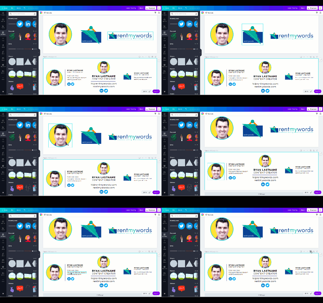
I bring it up now because this email signature has probably been the most involved Canva project I’ve undertaken in a while. Perhaps it was the expectations that I’d just coast through without issue, I don’t know.
I mean, I knew it would be easy to create something clean and crisp; I knew it would be easy to remove backgrounds from images, find the icons, and more.
But in terms of getting it all into the email signature, it took a lot of trial and error.
Here is the video walkthrough! If you need more explanation and additional instruction, please check out the info below.
Music: https://www.bensound.com/
Using Canva to Create an Email Signature
So, with that, I’m happy to pass along my findings; the tips and tricks to using Canva to help you create a nice, visually-appealing email signature.
1. Decide on the main visual element
The first thing on your way to creating a nice new email signature with Canva is to have some sort of idea of what you want to achieve.
There is plenty of inspiration out there, but really this comes down to figuring out if you want to feature something like your profile picture, business logo, or smaller version of your business logo.

This should be your first step because if you come to the realization that you really only want text in your email signature, then I’d probably recommend just sticking to the basic editing your email provider offers.
I’ll get into this more in a bit, but one key thing to remember with any graphical element is that you’re only going to be able to add one link per graphic.
So, if you have really clean looking lines of text for your email address, website, portfolio link, social media profiles, etc., you’re only going to be able to link that entire image to one destination.
2. Decide if you need to remove/replace your background
One of the more popular email signature features is the headshot, or a profile of your face and friendly grin. With that, one other popular measure is placing your photo within a frame or with a colored background.
So, if you’ve decided to feature your profile picture as the main graphical element, are you OK with the background of your photo or would you like to replace it?
If the latter, it’s extremely easy to replace your image background with Canva. The small problem is you need a Canva Pro account to be able to do so. Even so, the good news is you can sign up for a free 30-day trial to start.
Anyway, if you’re at the point of wanting to remove your image background, simply select the image and then go to “effects.” From there, you’ll see the option for the background remover tool—click it, and wait a few seconds…

Voila! You should now have your image without a background. I rarely run into an issue at this point, but if you need to do any additional touch up, you see the option to erase additional bits and pieces of the photo, or to restore anything that might have been removed on accident.
From there, now it’s the fun part in figuring out what kind of frame in which you want to feature your photo.
If you go to “elements” you’ll see the “frames” option near the bottom. Or, you can go ahead and just search “frame” in the search bar.
As you can see here, I’ve selected a classic circle, in which I’ve dropped my photo, and then changed the background color of it all to help it pop.
3. Decide on secondary elements
Now that you have your main visual, what else are you hoping to include? Of course, a tip for an email signature is to not make it too cluttered, but you can add a few other elements.
I personally prefer things like simple line separators between main sections, and of course, social media icons are a popular selection.
So, decide on what else you’d like to include and then go ahead and add them to your Canva design.
You can see here I’ve added a line separator along with two social media icons for Twitter and LinkedIn.
4. Download graphical elements
Once you have all of your elements, now comes time to download them from Canva.
After a lot of trial and error, here is what I found worked best for me and my goals.
Download the elements as PNGs
Normally I would suggest downloading them with transparent backgrounds, but because your emails are going to have a white background, and elements with transparent backgrounds can sometimes do weird things depending on the email client, don’t worry about the transparent background.
Be ready to edit sizes after downloading
I also wouldn’t worry too much about image size and canvas size as long as you have the means to crop and edit once downloaded. I found that it was just too time consuming without much return to try and find the perfect size within Canva.

Remember that you’re going to want separate elements
Again, as a reminder, anything you’re going to want to have a link attached to it—your website, email address, phone number, portfolio, etc. you’ll want it to be a standalone element. Meaning, you’re not going to want to use one image that includes your website address and social media icons if you’re going to want to link each of those elements to different URLs.
5. Crop elements
Once you’ve downloaded, you’re going to want to crop each element as tightly as possible. This means cropping your profile picture or your logo, the social media icons, etc.

You’re doing this because once you upload the elements for use in your email signature, you’re going to want to have as much freedom to space as possible, and if you have a lot of unused white space that hasn’t been cropped down, it’s going to be harder to do that.
5. Create table in Google Docs
If you were to go now and upload your elements to your email signature, you’re probably going to run into an issue.
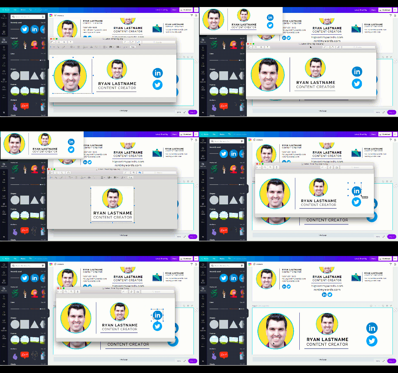
As you can see here, because we are combining graphics from Canva with your email text editor, everything doesn’t immediately play nice together.
Again, you can always create one really nice looking graphic in Canva for your entire email signature, but it’s not really practical if you want the different elements of your signature to be linked and clickable.
So, to get around that, we are going to utilize Google doc tables.

Just open a new document and choose “insert.” I’ve added a 2 column by 1 row (2×1) table here, but you can adjust for the different elements you want to display.
6. Paste to email provider
Now you should have everything you need to upload the different elements of your signature to your email provider.
In this video and for this project, I’ve used Gmail, and the option to edit your signature is in your general settings.
All you do is highlight your table in Google docs and copy it. Head over to Gmail and then paste everything into your window. You should see your table appear.
You can now upload additional images—in this case, I’m uploading a couple of social media icons I pulled from Canva.

You’ll want to then play around with the formatting to make sure everything is appearing as you’ve intended.
7. Add links to elements
As the final step, you’ll want to add links to the different elements you want users to click when they see your email signature.
For instance, if you’ve listed your website, you’ll want to add a link so the link can be clicked. Same goes for social media icons, portfolio links, and more.

And that’s it! Again, the process is going to take a bit of time, and some trial and error. If you run into any roadblocks or issues, let me know!


